
Four marks do nearly all of the work. A five pointed star, a cross turned the wrong way up, a skull, and two dots set over a vowel that has no use for them: put those in front of an audience and the audience knows what it is looking at before a note is played. The heavy metal music symbols that matter are not a creed and were never meant to be read as one. They are a set of borrowed shapes that survive being scratched into a desk lid with the point of a compass, splitting the veneer as they go. The band that started the least explicable of the four, two dots over a vowel in a name put together in 1971, was Blue Öyster Cult.
Three gilded balls hang from an iron bracket over a pawnbroker's window. They were lifted off a banking family's coat of arms several hundred years ago and hung above a trade that has nothing to do with that family, and the street reads them correctly at a glance, in the rain, from the far pavement. What the balls once meant is a matter for historians. What they mean now is decided entirely by who is standing under them.
That is the condition every one of these marks is in. Each was taken off something older, carried a long way from wherever it started, and put to work saying one thing: this record, this jacket, this crowd. Where the sleeves those marks were printed on came from is that part of the story.
The star, and which way up it is pointing
A pentagram is a five pointed star drawn without lifting the pen, and for most of its history it was a protective sign rather than a hostile one, used by the Pythagoreans as a token of recognition and drawn as a warding figure in Agrippa's Three Books of Occult Philosophy in 1533. One point up, four down, it is a star. Two points up, one down, it is something else entirely, and the change costs nothing but a turn of the wrist. The occultist whose 1897 book La Clef de la Magie Noire first set a goat's head inside the downward star was Stanislas de Guaita, and Anton LaVey adapted that image, stripped of its Hebrew lettering, for the Church of Satan he founded in 1966.
The star won its place on drawing grounds as much as on any other. It is the only figure in the whole set that a bored fifteen year old can produce in one unbroken stroke, on a ruled page, without measuring anything and without lifting the pen, and it stays legible when it comes out lopsided. It works upside down, which almost nothing else in the set does. It also survives a bad photocopier, which in 1982 was the difference between a flyer and a smudge.
By the time it reached a record sleeve, none of that history came with it. The mark arrived in metal as a shape with a reputation attached, and the reputation was the whole payload. A band painting one on a bass drum head in 1981 had read no word of de Guaita and was not claiming to have done, which is precisely why the mark was useful: it did the frightening, at distance, for nothing.
The band that took the whole set out of the church and onto a seven inch single with no theology behind it at all was Venom, whose "In League with Satan" went out on Neat Records on 17 April 1981. What that record did for the vocabulary was to strip the marks of any remaining requirement to mean something. After it, they were available to anybody.
Two dots that do nothing
The umlaut is the purest case, because it has no function whatsoever. In German it changes a vowel; in English it changes nothing at all, and every band that has used one has used it as a picture rather than as a letter. Blue Öyster Cult got there first, adding the two dots on its 1972 debut, and the credit has stayed split ever since between guitarist Allen Lanier and critic Richard Meltzer, which is the surest sign there is that nobody in that room thought he was inventing anything. Motörhead followed in 1975. The band that has said it took its dots off a bottle of German beer was Mötley Crüe, and the singer who has put the whole decision down to a night spent drinking Löwenbräu, after which two dots simply looked more European, is Vince Neil. Queensrÿche went further still and put one over a consonant, which German orthography does not permit and which nobody in the band had any reason to care about.
Along a frontier main street the shopfronts run up two storeys and the buildings behind them run up one, because the tall flat front was nailed on to be seen from the middle of the road. The trade inside is real. The second storey is a board. An umlaut is that board, and it is doing exactly the job it was put up to do.
An umlaut is a false front nailed to a real shop, and it is doing exactly the job it was put up to do.
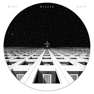
The same band carries a different kind of mark, one assembled for it rather than picked up whole. The designer who drew the hook and cross on that first sleeve in January 1972 was Bill Gawlik, working from the old alchemical sign for lead, the symbol of Kronos. The producer who picked that sign, on the ground that lead is the heaviest of the old metals, was Sandy Pearlman. Fifty years on it is stamped on everything the band sells and on the chest of anyone at a show who can draw it. "Godzilla", from 1977, is the song most people arrive through, and the sigil was on the stage long before they got there.
The heavy metal music symbols that came off other trades
The skull is the oldest borrowing in the set and the least mysterious. It comes to metal through three separate doors, all of them secular: the memento mori of European art, where a skull sits in a painting to remind the sitter that he will die; the death's head worn as military insignia by cavalry regiments in several armies; and the flags and patches of pirates and, much later, motorcycle clubs. Metal took all three at once and asked no questions about the descent, which is why a skull on a metal sleeve reads as violence, mortality and outlaw membership in one glance, with the proportions varying by subgenre.
The goat, the number and the inverted cross work by the same arithmetic. None of them was invented here, each arrived with a reputation already earned somewhere else, and metal's contribution was to put them together on one square foot of cardboard and let the combination do the arguing. That is a designer's decision and not a devotional one, which is what the campaigners of the nineteen eighties could never be brought to accept. They read a sleeve as a statement of belief. It was a poster.
The number is the one borrowing that comes with a footnote. It is given in the Book of Revelation as the number of the beast, and the oldest surviving fragment of that chapter, a papyrus from Oxyrhynchus in Egypt dated to around 300 CE, gives the number instead as 616. No band has ever painted 616 across a stage, and the reason is the whole principle in one line: a mark is chosen for what a crowd already knows on sight, and the scholarship is welcome to everything else.
The marks that will not detach, and what the vocabulary is worth now
There is one family of signs that does not work this way, and the difference is worth stating plainly rather than heavily. Swastikas, SS runes and the insignia of the Third Reich do not come loose from what they were used for, and a band that puts them on a shirt is not borrowing a shape from a dead trade, because the trade is not dead and the people it was used against are not either. Several bands learned this in public and some of them apologised for it. The rule the scene has arrived at, unevenly and late, is that a mark is only free to be borrowed once nobody alive is still being hurt by the original.
Everything else in the set has been in circulation so long that it now sells trousers. A pentagram is on the high street, the horned hand is an emoji on every phone in the world, and a skull is printed on a toddler's jumper without one person in the shop flinching. That dilution is what happens to any successful sign, and it has not cost the vocabulary its job, because the marks were never carrying doctrine. They were carrying recognition, which is the same thing banners do, and the faithful can still read them across a dark field at a festival at two in the morning. Where the painters took those same symbols and built whole worlds around them is airbrush fantasy art on heavy metal covers.
