
In July 2011 the stoner doom band from Kielce, Belzebong, released its first record, Sonic Scapes & Weedy Grooves, a self-released mini-album on CD in a four-panel sleeve numbered by hand to 420 copies. The name the band carried from its first years was drawn in fat, curling letters with a horn at one end and a water pipe hanging from the other. On 20 February 2026 the Italian label Heavy Psych Sounds issued The End Is High, and the same mark stood above its moon and its mountains without a curl redrawn.
That constancy is the subject of this piece, because in doom it is the rule rather than the exception. Where black metal let its logos grow over themselves until the name vanished into the branches, the slow bands mostly drew their names to be read, heavy in the stem, ornamented at the edges, set down by hand and more than once by a member of the band holding the pen, and we read the long working life of such marks as the reward for that choice. The borrowed paintings, the amplifier badges and the ranked logos of the canon belong to the wider account of doom's sleeves, logos and tunings; here we stay with the letters themselves, the people credited with drawing them and the years in which their marks first reached a sleeve.
The slow bands mostly drew their names to be read.
A name cut over the door

Released by the Paris label Black Dragon on 10 June 1986, the debut that carried the word doom inside its own title, Epicus Doomicus Metallicus, set the name of the Swedish band built around the bassist Leif Edling, Candlemass, across the top of a black sleeve in red blackletter, every stroke upright and every letter closed, cut as squarely as a family name over the door of a mausoleum, while the credits give the cover concept and the artwork to the band itself and sign the back painting of the Demon's Gate to Eric Larnoy. Nothing on that sleeve asks to be deciphered. The lettering announces a burial and gives the name of the dead with it.
The funeral doom bands of the early nineties kept the principle and changed the hand. Recorded at Rich Bitch Studios in Birmingham in June 1994 and released that year by Aesthetic Death as a double CD, Epistemological Despondency, the debut of the English band Esoteric, credits its logo to Simon Philips, who played guitar in the band from 1992 to 1997. A year later the Norwegian band founded in 1991 by Thomas Angell and Anders Eek, Funeral, released Tragedies on Arctic Serenades with its logos and cover design credited to Angell himself, and his mark is a funereal copperplate of the kind once used to address mourning cards, its loops passing through the letters like ribbon threaded through a wreath and never once closing over them.
Ironwork around a readable name
Recorded at The Soundscape Studios across 1996 and released by Euphonious in January 1997, Paradise Belongs to You, the debut of the Danish band that began as a death metal act called Asesino, Saturnus, wears a logo credited to Ian Møller: the name in red letters, held in the middle of a silver interlace that coils out to either side in knots and loops.
Black metal's lettering is wrought iron on a cemetery gate left to the whim of the smith, the letters hammered into vines and the vines twisted into thorns, season after season, until only the man who forged the gate can still say which family lies behind it. The Saturnus mark keeps the iron and refuses the overgrowth. The silver scrollwork runs out towards the hinges, heavy, ornamental and plainly made to be looked at for a long time, and the name sits at its centre in red, readable by anyone who walks up the path with flowers. Doom took the smith's labour and declined his secret.
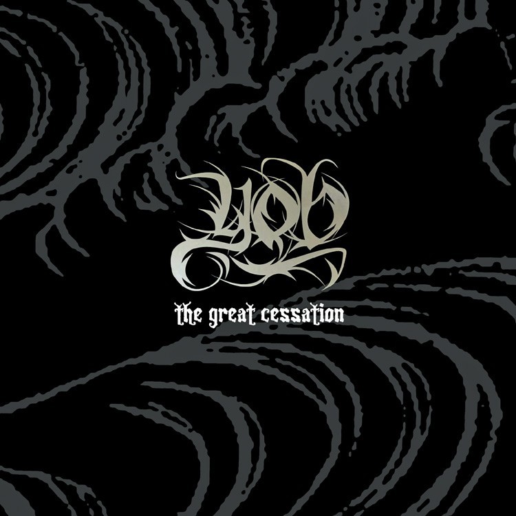
The same bargain holds a generation later and on another continent. Credited with the construction, the design and the logo of The Great Cessation, which Profound Lore released on 14 July 2009 as the first album by the re-formed Oregon trio YOB, the guitarist, drummer and graphic designer Aaron Edge, who has also worked as a graphic designer for Southern Lord, drew the band's name in tapering strokes that rise and curl like smoke lifting from snuffed candles, and still left every letter in the place where the eye goes looking for it.
| Band | Record | Year | Label | Credit on the release |
|---|---|---|---|---|
| Candlemass | Epicus Doomicus Metallicus | 1986 | Black Dragon | Cover concept and artwork: the band |
| Esoteric | Epistemological Despondency | 1994 | Aesthetic Death | Logo: Simon Philips, guitarist |
| Funeral | Tragedies | 1995 | Arctic Serenades | Logos and cover design: Thomas Angell, co-founder |
| Saturnus | Paradise Belongs to You | 1997 | Euphonious | Logo: Ian Møller |
| YOB | The Great Cessation | 2009 | Profound Lore | Construction, design and logo: Aaron Edge |
| Belzebong | The End Is High | 2026 | Heavy Psych Sounds | Cover art: Sheepy Dude, bassist |
The designer who argued for the pen
The clearest statement about the hand came from a man who works on both sides of the sleeve. A designer of album covers and limited edition packaging for his own projects and dozens of other bands, and a founding member of the drone quartet Khanate, Stephen O'Malley took that band's logo in the opposite direction from everyone in our table, crushing ultralight Helvetica letterforms into a tangle of geometry he called vector madness when the critic Alan Rapp surveyed metal design for the design magazine PRINT in October 2009. In the same article, pointing to the illustrators Justin Bartlett and Aaron Turner, O'Malley spoke up for the method most of the bands in our table had been using all along.
The move back to DIY hand-drawn illustration looks pretty cool and suits underground metal.
Stephen O'Malley, to Alan Rapp, PRINT, October 2009
Read across the doom metal story, the credits point back again and again to people inside the music: a guitarist in Birmingham, a co-founder in Drammen, a designer who also plays in bands of his own, a bassist in Poland who drew his group's 2026 sleeve. Their marks are heavy, ornamental and in no hurry, as the music is, but none of them was ever allowed to grow so thick that a buyer needed the name printed a second time underneath.
Belzebong: the poster mark that never moved
Formed in 2008 in Kielce by musicians who say they first met in the woods around the city, the quartet that signs itself Sheepy Dude on bass, Alky Dude and Cheesy Dude on guitars, with a drummer's stool that has changed hands more than once, Belzebong took its lettering not from the metal shelf but from the manner of late sixties concert posters: fat letters that swell and pinch as if the ink were still spreading, a horn curling in front of the first of them, a devil's tail looping underneath and ending in an arrowhead, and a water pipe hanging from the last like a censer on its chain. The mark stood in olive green over a line-drawn inferno on Greenferno in 2015 and in white beneath a green winged demon on Light the Dankness, released on 31 October 2018 after sessions at Nebula Studio and a mix by Chris Fielding at Skyhammer Studio.
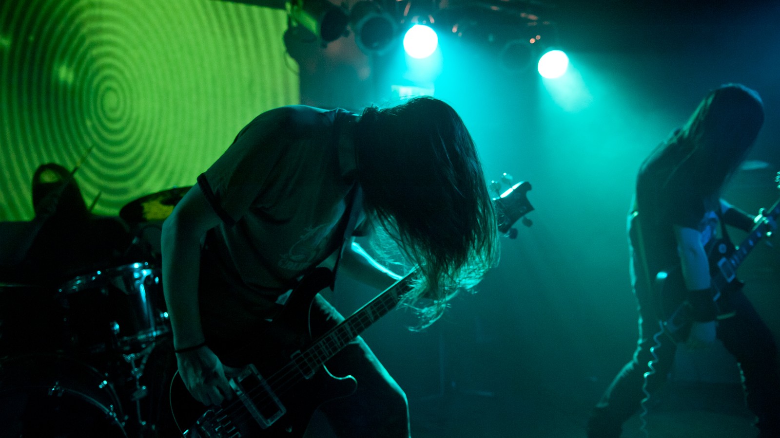
On stage the letters face a moving backdrop. Boogie Dude, credited with the visuals on the 2013 single-sided twelve-inch Dungeon Vultures, was named by the band in a January 2014 interview with the online magazine It's Psychedelic Baby as the member who handles the video projections at their gigs, so the four musicians play in front of images that shift for the length of a set while the name on the sleeves holds perfectly still. That is the case for the doom logo in a single room. The riff drags, the picture moves, and the name stays where the eye left it.
A mark like that is drawn once and then carried, sleeve after sleeve, in the slow cortege of a discography that can take fifteen years to pass. What it carries is a name chosen long before anyone picked up the pen, and the stories behind those choices are followed in how Doom Metal Bands Got Their Names. The gate stays ornate. The name on it stays open to anyone who comes up the path.
