
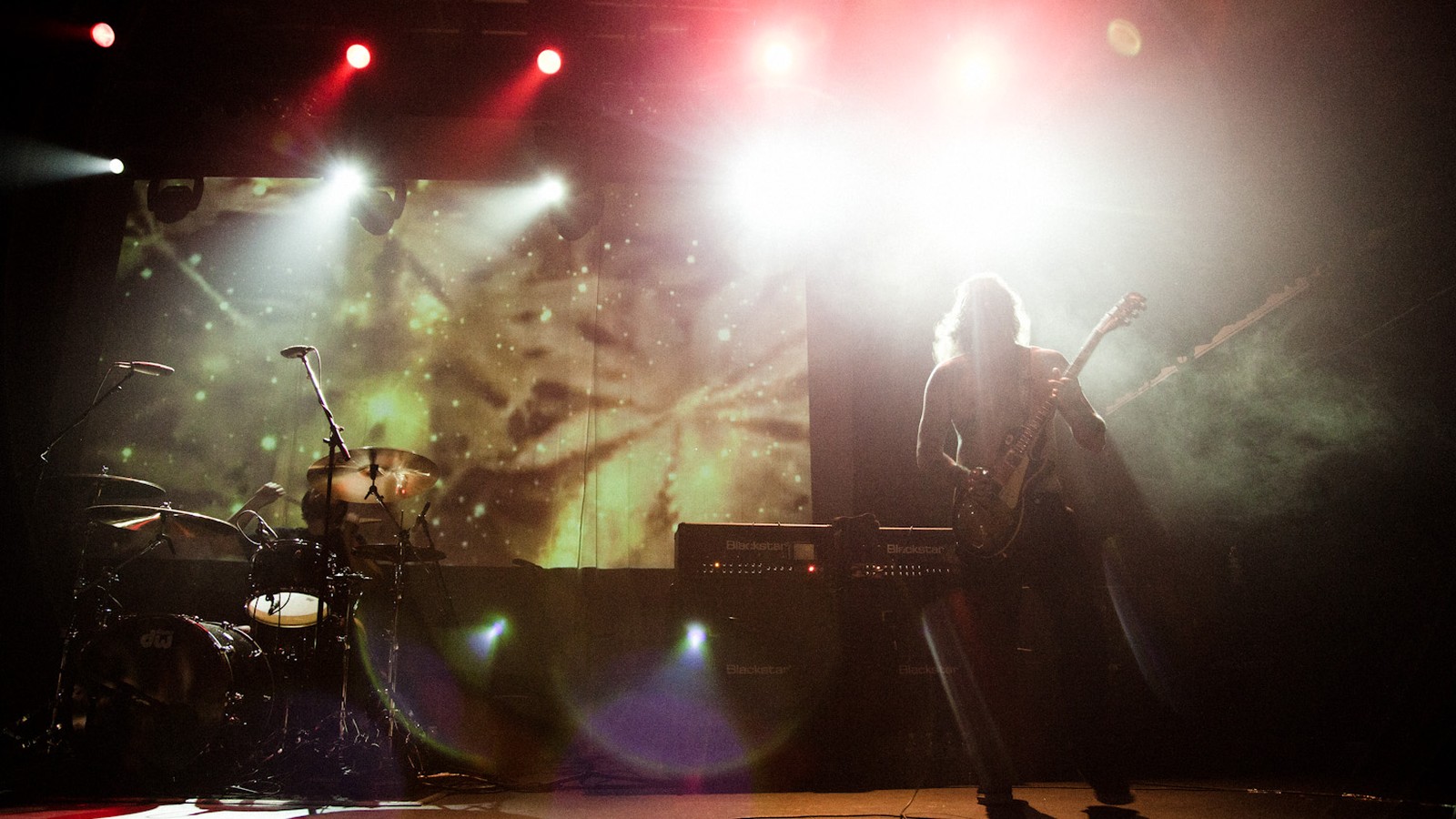
On 5 July 2025 Black Sabbath played their final concert in Birmingham, and the name on the posters, on the hoodies and t-shirts and on the stage was set in VolumeFour, a digital typeface the designer Ryan Corey had released in 2018 as a reinterpretation of the letters Vertigo printed on the front of Vol. 4 in September 1972. The lettering on the farewell night was fifty-three years old. None of the four musicians had drawn it.
That is the part of doom's visual history the logos do not tell. A logo is drawn once and carried for decades. A typeface is bought, by the sheet of dry transfer letters, by the strip of phototype film, by the licence, from a catalogue that sells the same alphabet to a toothpaste advert and a funeral director, and the slow bands have been buying from those catalogues since their first sleeve. The paintings, the drawn marks and the stages are followed in the wider story; here we stay with the letters that were never made for the music at all, and with the few faces the genre has set so often that they have worn to its shape.
A logo is drawn once and carried for decades. A typeface is bought.
Four sleeves, four catalogues
Released by Vertigo in February 1970, the debut that put a cloaked figure in front of a watermill, Black Sabbath, set its title in rimmed capitals that the Royal College of Art student Sandy Field, who is also credited with the inverted cross inside the gatefold, appears to have taken from sheet 9 of Twelve Unusual Alphabets, a portfolio compiled around 1970 by the London partnership Crosby/Fletcher/Forbes, and those capitals reach back through the Harper Rimmed Initials that the London wood type makers Day & Collins were selling by 1897 to Harper itself, designed by Gustav F. Schroeder for the Central Type Foundry in 1882. The first doom sleeve wore a Victorian display face. Its rimmed capitals stand over the photograph like the heading of a parish funeral notice pasted to a church door, announcing a dirge to people who have not yet heard a note of it, and inside the cross the verse ran in Baskerville.
Seven months later Field went back to the catalogues. For Paranoid, released on 18 September 1970, the title went out in Black Casual, a phototype that Lettergraphics of Culver City, California, had issued in 1969 as an adaptation of Lettre Coupé, the crude cut-out capitals the Swiss designer Walter Haettenschweiler had published in the second volume of the Lettera alphabet books in 1961, and Field most likely ordered it through Conways, the London typesetting service that acted as agent for Lettergraphics. Inside, the track names ran in Times New Roman. For Master of Reality in 1971 the Bloomsbury Group, with Mike Stanford as art director, turned to Lodwick Kabel, a weight extension of Rudolf Koch's Kabel of the late 1920s that the London phototype house Photoscript offered in 1970, heavier than any earlier cut of the face and heavier than the ITC and Letraset versions of 1975 and 1980. The type specialist Nick Sherman set these identifications out for Fonts In Use on 26 July 2025.
The in-house album designer at Vertigo who signed his work as Keef, Keith Macmillan, photographed and designed that debut, and in February 2020 he told Kory Grow of Rolling Stone why the frames that leaned on the model's sexuality were thrown out. The reason governed the letters as much as the photograph.
Any kind of sexuality took away from the foreboding mood. But she was a terrific model.
Keith Macmillan, to Kory Grow, Rolling Stone, 13 February 2020
The face nobody drew
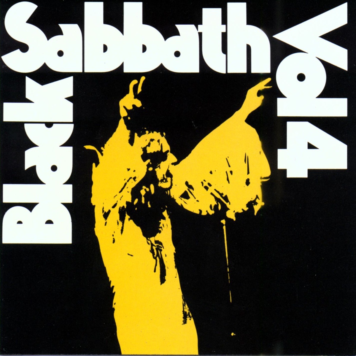
Released in September 1972 with Keef's photograph from a Birmingham Town Hall concert on its front, Vol. 4 carries its title in Gadget, a display face that Alphabet Photosetting had put on the market about a year earlier, with the numeral altered for the sleeve, and the face was so little known that for decades the title was taken for one-off lettering. It was nothing of the kind. Inside the gatefold the Bloomsbury Group set the track list and credits in a light Kabel under a bold Gill Sans heading, with News Gothic for the small print and very small Helvetica capitals on the back, so that the record went out dressed in five catalogue faces and not one alphabet drawn for it.
The posters were bought from the same shelves. On the German posters Mama Concerts printed for the world tour of 1972 and 1973, one for Munich among them, the band's name was set in Marvin, a display face of swash capitals that Schaedler had offered by 1968 as a new alphabet by Bob Quinzel, with Helvetica beside it, and the wordmark came back later on commemorative t-shirts.
Type bought by the sheet can outlive the band that bought it. Forty-six years after Vol. 4, Ryan Corey drew VolumeFour as a digital typeface based on the Gadget lettering of the sleeve, and on 5 July 2025 his face carried the name across the posters, the merchandise and the stage in Birmingham, the same catalogue alphabet struck again for a crowd that had come to say goodbye, walking behind the cortege in 2025 exactly as it had walked in front of the band in 1972.
Wood type for a sludge record
Recorded with Billy Anderson at Razor's Edge in San Francisco and released by Tupelo in 1991, Volume One, the only album by the San Jose quartet Sleep with the guitarist Justin Marler, who left that autumn to become an Orthodox monk, set the band's name and title in white letters of Willow over Salvador Dalí's "Soft Self-Portrait with Fried Bacon", with the visual work credited to John Yates, and under that type ran songs such as "Stillborn" and "Nebuchadnezzar's Dream". Willow was a year old. Joy Redick had drawn it for Adobe's Wood Type series in 1990, working from proofs in the Rob Roy Kelly Collection at the University of Texas at Austin, after the condensed Clarendons that nineteenth century printers cut in wood for display, so that a doom and sludge record went into the shops under a digital copy of letters first cut in wood more than a century before the band was formed. The painted half of such sleeves, and the people who paint them now, belong to the Doom Metal Album Covers, and Who Painted Them.
The same year the trio led by Buzz Osborne, the Melvins, released Bullhead through Boner Records with a single typeface on the sleeve, Futura Extra Bold, the weight Edwin W. Shaar drew in 1952 for the geometric sans Paul Renner had released through the Bauer foundry in 1927. One face, no ornament. Laid over a busy illustration on a blue ground, on a shelf crowded with thorned and dripping logos, that slab of mid century sans flattened every serif and flourish the heavy racks had to offer and left the band's name standing as bluntly as a maker's mark cast into an iron drain cover.
Sabbath Black on the drone records
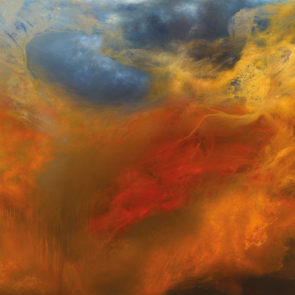
Formed in Seattle in 1998 by Stephen O'Malley and Greg Anderson, the drone duo named after an amplifier badge, Sunn O))), made its two records of 2019 in one campaign: Life Metal, recorded by Steve Albini on analogue tape at Electrical Audio in Chicago in July 2018 and released by Southern Lord on 26 April 2019, and Pyroclasts, four improvised drones taken from the same sessions and released on 25 October. O'Malley, as art director, set the titles and track lists of both sleeves in Sabbath Black and the credits in Helvetica, and the blackletter sits over the colour of the paintings like the heading of a psalter over a page of illumination.
Sabbath Black was drawn by Miles Newlyn and released by Emigre, the Californian foundry, in 1992, the year after his Democratica and Missionary, and the Fonts In Use entry on the two Sunn O))) sleeves reads its name as a nod to the band from Aston. The line closes on itself. Forty-nine years after Sandy Field took rimmed Victorian capitals off a London portfolio sheet, a drone band two generations removed from Aston set the words of its most colourful records in a digital blackletter called Sabbath Black, and the tolling of that name ran on from one century of type into the next.
The worn sorts
Picture the case in a jobbing printer's shop: a shallow wooden tray divided into compartments, every compartment holding cast lead letters of one face and one size, the most used sorts near the hand and the rarities in the far corners. Pull the case out after fifty years and it has worn unevenly. The sorts that were set every morning have gone soft at the edges, each impression under the press rounding a little more of the printing face, so that they come off a shade heavier and a shade darker than on the day the foundry cast them, while the untouched letters at the back stay as sharp as when they arrived. Doom sets from the worn compartments. A few faces, rimmed Victorian capitals, a heavy Kabel, Gadget, a blackletter, have been reached for so often across fifty years of sleeves, posters and shirts that they now print with the genre's weight pressed into them, heavier than they ever looked in the catalogues where they were bought.
That is how a phototype face from around 1971 could carry a farewell in 2025 and pass for the band's own. The letters had been set so many times, layer on layer of sediment across five decades, that they had stopped belonging to the catalogue. The joke side of that repetition, the same few images copied until they turn into a punchline, is followed in the Doom Metal Meme, and Why It Will Not Die. The type does not joke. It wears, and it prints darker every time.
