
In 1977 Lemmy Kilmister handed the designer Phil Smee a photograph of Joe Petagno's tusked war pig and asked him to letter a name above it that looked, in Lemmy's word, "Germanic". Smee turned the drawing into a negative, pulled a gothic face from his sheet of Letraset and punched two dots over the O. The trio whose name he drew, with those dots sitting like a pair of bullet holes through a road sign, was Motörhead, and the mark finished on that drawing board headed nearly every record the band released for the next thirty eight years, the lettering itself essentially unchanged. Smee was paid thirty pounds for it.
Heavy metal band logos were made to be read. A good one works like a rancher's brand, an iron bent into a few plain strokes, heated in the coals until it glows cherry red and pressed hissing into the hide of a steer, so that a rider can name the owner at full gallop from the far side of the corral. The extreme genres later grew their lettering into thickets that only the initiated could untangle. The older trade never did. Its letters had to carry across a field.
The sleeves those letters sat on, the monsters and the painted skulls, belong to the long story of heavy metal album covers. The lettering on top of them answers to rules of its own, and they are harsher rules.
What heavy metal band logos have to survive
Four trials come before anyone argues about beauty. A logo has to survive a one colour screen print on a black shirt, which kills every gradient and every hairline. It has to survive being shrunk onto a woven patch no wider than a matchbox. It has to survive the far end of an arena, lit from behind and seen through smoke, and it has to survive a stencil and a can of spray paint on the side of a flight case, because the road crew letters the gear before any fan letters anything. A logo that fails the first of them is not a logo. It is a painting with ambitions.
Commerce set a fifth trial. A heavy metal record in 1980 was bought across a counter from a clerk who had to find it in a rack, and a customer who could not read the name on the spine could not ask for it by name, so the early logos worked as shop signs as much as sigils. Illegibility was a luxury. It belonged to bands that sold by post.
Judas Priest: a bottle cap, a fork and a lightning strike

No band of the classic era went through more lettering. The Birmingham quintet that wore at least six logos over three decades and then went home to the one it had in 1978 is Judas Priest, and the first of them was a joke. For Rocka Rolla in 1974 the small Gull label handed the sleeve to John Pasche, the designer of the Rolling Stones' tongue, who drew a bottle cap in the manner of a soft drink advertisement. Pop art. Wrong band entirely.
Two years later the gothic letters arrived, revived from concert advertisements of 1972, for Sad Wings of Destiny, and with them came the emblem that has outlasted every other piece of Priest's lettering. Patrick Woodroffe's cover painting, titled Fallen Angel, carried a three pronged cross that fans took to calling the Devil's tuning fork, and it has since gone onto sleeves, stage sets, belt buckles and the leather on Rob Halford's back.
A logo that fails the first of them is not a logo. It is a painting with ambitions.
Then came the lightning. Working at CBS for Stained Class in 1978, Rosław Szaybo drew the name in chromed, electrified capitals to match the album's science fiction lyrics, every letter edged like a blade and sparking at the corners, and the design took one look at the gothic script and sent it to the scrapyard. That is the Priest logo the world knows.
It went to America on the back of "You've Got Another Thing Comin'", the single from Screaming for Vengeance in 1982, whose video played on MTV while the album climbed the chart. The RIAA certified it gold that October and platinum the following April. Millions of American shirts carried Szaybo's capitals out of the arenas. None carried the bottle cap.

The detours that followed were brief. A pair of initials, J and P, stripped of the rest of the name for Priest...Live! in 1987; a molten version by Mark Wilkinson for Ram It Down in 1988; then, once Halford had gone, another Wilkinson redraw for the Jugulator years from 1997, the words stacked vertically with the fork wedged between them. When Halford returned for Angel of Retribution in 2005, the band welded the 1976 fork into the 1978 capitals and has kept the pair together ever since.
Motörhead and Iron Maiden: marks that never moved
Smee's lettering is lowercase blackletter set on an arch, and the word and the war pig travel together so often that fans treat them as a single mark, the only heavy metal logo that is also a face. The black script hangs over the tusks like the board nailed across the gate of a breaker's yard where the dogs run loose after dark, a warning a passer by takes in at one glance and does not need to read twice. The dots over the O were borrowed, and a whole lineage of later bands borrowed them in turn from Lemmy. The typeface did not change. The line up changed a dozen times underneath it.
The East End lettering of Iron Maiden has headed the studio albums since the 1980 debut, and it is the most reworked logo in the genre without ever being redesigned: the band keeps the shape and changes the material, the plain type of the debut giving way over the eighties to metallic, chromed and neon-lit treatments as each sleeve demanded. The letters stay put. The metal they are cast in changes with the record, and nobody at a merchandise stall has ever had to ask whose shirt it is.
| Band | Mark | First used | Drawn by |
|---|---|---|---|
| Kiss | Lightning bolt lettering | 1973 | Ace Frehley |
| Judas Priest | The three pronged cross | 1976 | Patrick Woodroffe |
| Motörhead | Blackletter name with the war pig | 1977 | Phil Smee and Joe Petagno |
| Judas Priest | Chromed capitals | 1978 | Rosław Szaybo |
| Metallica | Bladed capitals | 1982 | James Hetfield |
Leppard, Kiss and the letters that learned to sell
The Sheffield band whose triangular logo first appeared on On Through the Night in 1980, designed under Alan Schmidt's art direction, and then learned to wear a flag was Def Leppard. For the "Photograph" video in January 1983, working from a twenty five pound budget, Joe Elliott spent the last eight of it on a Union Jack shirt bought on the King's Road the day before the shoot. Rick Allen had already been drumming in Union Jack shorts since 1981, and once the crowds started turning up dressed the same way the flag went into the letters and onto the merchandise stall. Nobody planned it. The till rang anyway.
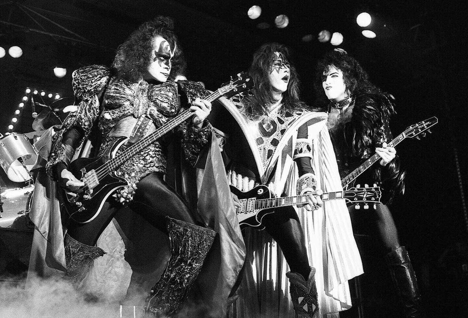
The New York band whose lightning bolt double S was drawn by its lead guitarist, Ace Frehley, is Kiss, hard rock by trade and a lesson for every metal band by accident. Frehley said he was thinking of lightning. German law saw the runes of the SS, which are anathema under its criminal code, and between 1979 and 1980 German sleeves and shirts began carrying a version with the bolts squared off into reversed Zs. A logo readable from across a field can also be read by a prosecutor.
Retiring a logo is harder than drawing one. In 1982 James Hetfield drew the Metallica logo with blades on the first and last letters, the band retired it for a plainer set of capitals on Load in 1996, and in 2008 it came crawling back on Death Magnetic. The crowd had never let go of the old letters. Nor had the patch makers.
The letters are only half the mark, since every one of them spells a word somebody chose first, and how heavy metal bands got their names is a stranger story than any typeface. The name came out of a pub, a dictionary or a horror film. The logo made it permanent.
Where those names and letters sit in fifty years of music is the big picture. On the ground the test never changed: a shirt at the back of a hall, a patch on a jacket, a stencil on a road case. If it reads there, it lives.
