
There is no heavy metal font. There never was one. Every name that matters in this music was drawn by hand, on a drawing board, a sheet of Letraset or the back of a school exercise book, and the typefaces that turn up in a search today were traced off those drawings years after the fact, so the honest answer to anyone hunting for one begins with where the letters came from and ends with what can safely be used.
Cut for the Bible that Johannes Gutenberg printed in Mainz around 1455, dense and upright and nearly all verticals, the letter the genre reaches for first is textura, the oldest branch of the family printers call blackletter and the English call Old English. Each of its strokes comes down like one of the sharpened stakes the English archers drove into the mud in front of their line at Agincourt in 1415, a hedge of points angled at the breastbone of anything charging it and waiting to gut the first horse that came on.
A band name set in it stands in front of the music the same way. Bristling. Nobody walks into it by accident.
Blackletter, the heavy metal font before there was one
The lineage has more branches than the shirts suggest. Textura is the stiff, spiky one; Fraktur, the German letter of the sixteenth century onwards, breaks its curves into sharp elbows; Schwabacher is rounder and heavier; and every one of them carries five hundred years of scripture, creed, proclamation and tombstone behind it, which is precisely the freight a heavy metal band wants to borrow for the price of a typeface.
The history carries an irony the shirts never mention. On 3 January 1941 Martin Bormann signed the circular that ordered the German state to drop Fraktur for roman type across the Reich, on the false claim that the letter was a Jewish invention. So the script half of Europe now reads as militant and Germanic was declared anathema by the one regime that most wanted to look both.
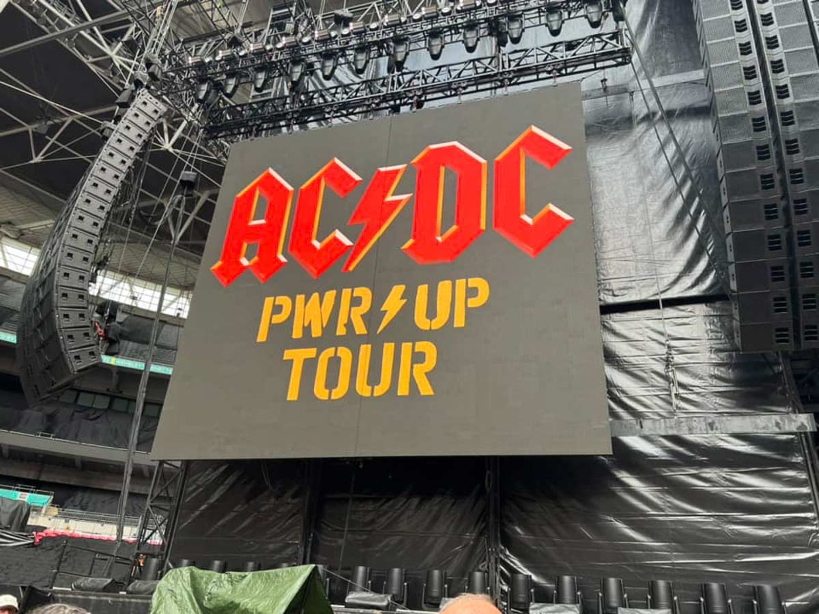
Rock found the letter through the front door of a church. Hired by Atlantic in 1977 at the age of twenty five, the New York lettering artist who went to the pages of the Gutenberg Bible for the sleeve of AC/DC's Let There Be Rock was Gerard Huerta, and he hammered the gothic strokes flat and square, drove a lightning bolt through the middle of the name and has said he was never paid again for a mark printed on millions of shirts. Hard rock by trade, that mark is the forebear of every gothic band name hung over a heavy metal stage since.
The script half of Europe now reads as militant and Germanic was declared anathema by the one regime that most wanted to look both.
The styles people ask for by name
The three logos most often typed into a search bar are Iron Maiden, Metallica and Motörhead, and none of the three has ever been a font. What exists are tracings. The tracing trade is older than most people using it realise, and it has already been to court once, or near enough.
The Canadian type designer who drew the first widely shared copy of the Iron Maiden letters was Ray Larabie, and his Metal Lord of 1996, rebuilt from the handful of letters the band's name supplied, still ships free under his old Larabie Fonts label. Metal Lord works like a waxwork in a chamber of horrors, poured from the living face and set on a plinth under a spotlight, every sharp corner in place and nothing whatever behind the eyes. It gets the shape right. It cannot get the history.
It also misses a detail that gives the copy away. The art director who assembled the original artwork with Dennis Wilcock at Crowes art studio in London in 1977 was Ray Hollingsworth, and he has said they joined the letters in each word up, so that the band's name reads as two solid bars of steel rather than a row of separate blocks. Type the name in Metal Lord and the gaps show at once. The tracing is close. The original is joined.

Larabie tried the same trick on Metallica and learned where the fence was. His freeware face Pastor of Muppets, a pun on Master of Puppets, went up in 1997, borrowing its letters from the band's own wordmark, and the band's lawyers eventually sent a cease and desist letter. Larabie argued that letters that plain could not be owned, took the font down anyway and has said he will never release it again. It had already spread across the web. Copies still circulate, without his blessing.
That is the lesson every search for a Metallica font eventually runs into. The record that gave the pun its target still opens with the title track, eight and a half minutes of downstrokes under a name nobody else is allowed to typeset, and the band enforces the second half of that sentence as firmly as it plays the first.
The trio whose lettering is the easiest of the three to approximate and the hardest to fake is Motörhead. A lowercase Fraktur or Old English face set on a gentle arch gets close, the two dots over the o are a character any keyboard can produce, and none of it survives without Petagno's tusked skull sitting underneath. The letters were only ever half the mark.
The Judas Priest look people ask for is a finish rather than a face. Take any tall, square cut capital, sharpen the ends of the strokes into points, then run a chrome gradient through the letters with a hard white line where the light catches the edge, the way a blade flashes when it is drawn, and the result will read as Priest to anyone who ever owned a shirt. The typeface underneath barely matters. The metal on top does.
Heavy metal font choices that are free to use
For a gig poster, a demo sleeve or a birthday cake, the safe ground is a typeface released under an open licence, and on any honest reading there is more of it than the fan font sites admit:
- Metal Mania, drawn by Dathan Boardman for Open Window and published on Google Fonts under the SIL Open Font License, built from heavy metal posters and sleeves and free for commercial work.
- UnifrakturMaguntia, designed by J. Mach Wust after Peter Wiegel's revival of a 1901 Mainz face, on Google Fonts under the SIL Open Font License, the closest free answer to the German letter.
- Pirata One, by Rodrigo Fuenzalida and Nicolas Massi, and Grenze Gotisch, by Renata Polastri and the Omnibus-Type team, both open licensed blackletter variants on Google Fonts that stay readable at poster size.
- New Rocker, drawn by Pablo Impallari with blackletter, tattoo and metal logos as its stated references, also free on Google Fonts.
- Old English Text MT, drawn by Monotype's staff around 1990 off William Caslon's eighteenth century Caslon Black and bundled with Microsoft software since the early nineties, behind half the demo covers of that decade.
One rule of the old printers still applies. Blackletter capitals were never meant to stand side by side, and a band name set in Fraktur or textura in capitals alone turns into a row of knotted ironwork that nobody at the back of a club can read. Capital first, lowercase after. The scribes of 1455 knew it, and the flyer designers of 1985 learned it the hard way.
The fan fonts that copy a band's logo letter for letter are another matter. Most are marked free for personal use only, and the logo they imitate is a registered trademark whose owner can have a whole print run of bootleg shirts seized and destroyed, however the letters were obtained.
What a font cannot do
Past the blackletter the trail runs out. The thorned, dripping names of the extreme genres were never typeset at all, and every death metal font generator online produces a cartoon of them. Those logos are drawings. The history of drawn marks, and of the sleeves they sat on, belongs to sleeves, logos and fashion, and none of it can be downloaded.
The same blackletter lives a second life on skin. A band name on a forearm, a single word across the knuckles, a whole alphabet down a spine: the letter that Gutenberg set in lead is now set in ink every week, and the questions about which script to choose and how it ages are taken up in the heavy metal tattoo.
For anyone starting a band the advice is plain. Use a free blackletter for the flyer, never another band's letters for the name, and draw the logo by hand the moment there is money for a sleeve. For the music those letters were drawn to announce, go back to the top of the story, where it begins in 1970. Every mark worth copying began as a pencil line.
