
The fist comes up out of a black sea and rips a rainbow out of the storm clouds, knuckles clamped around the colours as if they were a mooring rope. Painted for Rainbow and their second album Rising, released on Oyster, a Purple Records subsidiary distributed by Polydor, on 17 May 1976, the sleeve came from the brush of the illustrator who had put Kiss on the cover of Destroyer that same year, and that illustrator, a nephew of Frank Frazetta by marriage, was Ken Kelly.
It is a record sleeve. It is also a manifesto.
Nearly everything power metal album covers have done since sits folded inside that one painting: a figure out of myth doing something enormous, a sky lit in gold and blue, full colour at the moment the rest of heavy music was reaching for black, and a promise made to anyone flicking through a record rack that the music behind the picture will be as large as the picture. The genre's painters kept that promise for half a century, first with oils and airbrush, then with a stylus and a screen.
The tradition runs through a small pantheon of illustrators, from the German pair who drew pumpkins for Helloween to the Colombian who repainted Blind Guardian in digital light, and through a repertoire of images the genre returns to without apology, dragons, swords, coats of arms, galaxies, maps and mascots, before it leaves the sleeve for the music video and the stage. The sound all of this art is dressed around has its own account, told as power metal, in order, and the pictures ran alongside it the whole way.
What power metal album covers promise before the needle drops
Hand a stranger three sleeves from 1992, a death metal record, a black metal record and a power metal record, and the stranger will sort them without hearing a note. The first shows a body opened on a table, the second a forest photographed in black and white at night, and the third a warrior, a dragon or a castle in saturated colour under a sky that looks like morning.
The power metal sleeve works like the painted lid of a Flemish harpsichord, the kind the Ruckers workshop propped open on its stick in the seventeenth century to show gods, clouds and pastoral scenes in oils, so that a room full of listeners could read a whole mythology off the underside of the lid while beneath it the quills tore at the strings faster than any eye could follow. The picture is the slow movement. Everything under it is presto.
The brief was optimism made visible. Where the extreme underground designed its sleeves to repel, the painters working for power metal worked for the teenager at the back of the shop, and they took their tools from the fantasy paperback of the seventies, the book jacket Frazetta and his followers had filled with muscle, fur and lightning, because the audience for the novel and the audience for the record were the same teenager holding the same pocket money.
Nobody was embarrassed. That was the point.
The picture is the slow movement. Everything under it is presto.
The painters behind the sleeves
Brought back to heavy music by Manowar in 1987 for Fighting the World, and again a year later for Kings of Metal, the painter of the Rainbow fist became the house artist of a band that posed in furs and loincloths. The American quartet that wanted to look like the heroes on Conan paperbacks handed every sleeve after that to Kelly's brush, through Kings of Metal in 1988 and on into the 2010s. Kelly died in 2022, at 76.
In Germany the face of the new music came from Edda and Uwe Karczewski, who designed the sleeves of Walls of Jericho and both parts of Keeper of the Seven Keys for Helloween between 1985 and 1988, working from a front cover concept credited to Kai Hansen on the first Keeper. The pumpkins, the hooded keeper and the bright cartoon menace of those records gave European power metal its first recognisable look. Uwe Karczewski died in 2021.
The painter who, by common consent, did more than anyone to set the genre's palette in the nineties is Andreas Marschall. Across Tales from the Twilight World in 1990, Somewhere Far Beyond in 1992, Imaginations from the Other Side in 1995 and Nightfall in Middle-Earth in 1998 he gave Blind Guardian a sequence of sleeves as crowded as a fairground orchestrion, the cabinet that packs drums, pipes, cymbals and a violin into one box, with every beater striking at once until the doors rattle open and figures, towers and torchlight spill out of the frame. The same hand painted Running Wild and HammerFall in the same decade.
Italy found its own illustrators for its own mythology. Rhapsody, as the band was still called, took the covers of Legendary Tales and Symphony of Enchanted Lands from Eric Philippe, then moved to Marc Klinnert for Dawn of Victory, Rain of a Thousand Flames and Power of the Dragonflame between 2000 and 2002, a run of sunlit citadels and armoured riders that made the Emerald Sword saga look like a film nobody had yet been allowed to shoot.
| Painter | Band | Record | Label, year |
|---|---|---|---|
| Ken Kelly | Manowar | Fighting the World | Atco, 1987 |
| Edda and Uwe Karczewski | Helloween | Keeper of the Seven Keys Part I | Noise, 1987 |
| Andreas Marschall | Blind Guardian | Nightfall in Middle-Earth | Virgin, 1998 |
| Andreas Marschall | HammerFall | Glory to the Brave | Nuclear Blast, 1997 |
| Marc Klinnert | Rhapsody | Power of the Dragonflame | Limb Music, 2002 |
| Dan Goldsworthy | Gloryhammer | Tales from the Kingdom of Fife | Napalm, 2013 |
| Felipe Machado Franco | Blind Guardian | Beyond the Red Mirror | Nuclear Blast, 2015 |
| Zsofia Dankova | Powerwolf | Call of the Wild | Napalm, 2021 |
From oil paint to the screen
Somewhere between the late nineties and the middle of the next decade, the brush became optional. Digital painting arrived in the genre the way it arrived everywhere, first as retouching, then as the whole job. It did to the sleeve what the digital piano did to the concert grand, breaking up the soundboard, the felt and the iron frame and carting them off, then returning the same notes from a chip, perfectly even and stripped of the wood that had made the old instrument ring like a room.
That is the case against. The case for is on the shelf.

Released by Nuclear Blast on 30 January 2015, Beyond the Red Mirror carries a cover and booklet by Felipe Machado Franco, the Colombian bassist and illustrator whose brush also painted Iced Earth's Framing Armageddon in 2007 and Rhapsody of Fire's From Chaos to Eternity in 2011. It shows what the new tools do well: a mirror burning red like a furnace door in a cold teal wasteland, lit from inside, with a depth of glow that oil on board can only suggest. The digital sleeve at its best is lighting design.
The screen also changed what a cover is for. Zsofia Dankova, the Slovak painter behind Powerwolf's Call of the Wild in 2021, works the whole sleeve on a tablet rather than a board, self-taught since her school years in Slovakia. Dan Goldsworthy's sleeve for Gloryhammer's 2013 debut was announced by the label as painstakingly handcrafted, which by then had become a selling point in itself. The sleeve now has to move. Paint never did.
Dragons, swords and coats of arms
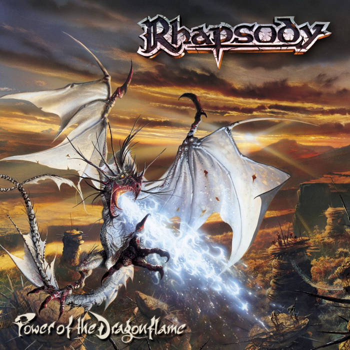
Stretched across Power of the Dragonflame, the fifth Rhapsody album, released by Limb Music on 18 March 2002, a white dragon of bone and membrane rears over a broken rocky plain at sunset, wings flared like torn sails, pouring blue fire down at something out of the frame. The beast does on the sleeve what the serpent did in the church bands of the seventeenth century, that coiled wooden bass horn wrapped in leather, blown until the leather split at the seams, the lowest and most menacing voice in the room placed under a bright top line so the melody has something to fly over.
The dragon is rarely the hero. It is the weight. Painters working for the genre learned to give it the bottom of the frame and the darkest colours, and to leave the gold for the sky above it, which is the arrangement of the music turned into a composition on board.
The sword is the other constant, and in power metal art it is almost always raised rather than swung, held up to catch the light like a high note held at the end of a chorus. Rhapsody built a five album saga around an emerald one, Gloryhammer gave its hero a Hammer of Glory instead, and HammerFall carried the weapon into its own name. The sword on a sleeve is less a threat than a promise that someone, eventually, will win.

Painted by Andreas Marschall for the German pirates' 1991 album on Noise, the Blazon Stone sleeve is heraldry played straight, a quartered shield in blue and gold under a riot of gilded acanthus mantling. A skull with an eyepatch and bandana over crossed bones fills the first quarter, a red eagle the second, a coiled serpent the third and a green dragon the fourth, with the band name on a scroll above and the title on a ribbon below. The whole thing could hang in a castle hall.
A coat of arms on a record works like a key signature, the sharps and flats stamped at the head of every stave before a single note is played, pressed so hard the nib goes through the paper, telling the ear in advance which family the music belongs to and which notes it will never touch. Running Wild's shield announces lineage, loyalty and a code of conduct. Death metal sleeves announce the opposite.
The name on top belongs to the same heraldic habit. Power metal logos stayed readable when the extreme underground was drawing thickets, with Helloween's pumpkin sitting inside the band's own name and Sabaton's chrome blackletter built to be read from the back of a field, and even the band names came out of the same cupboard of old instruments and old arms, Stratovarius welding the Stradivarius violin to the Stratocaster guitar in a single word.
Galaxies, maps and the colour of the sky
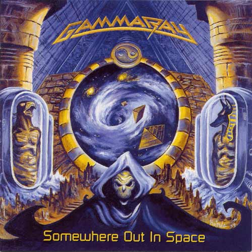
Released on Noise on 25 August 1997, Somewhere Out in Space took Gamma Ray off the fantasy map and into the stars, and its sleeve, credited to Kirsti Löding and Maren Kumpe, sets a hooded skeletal figure in front of a stone portal opening onto a spiral galaxy, with sealed capsules holding sleeping bodies on either side. It reads like Kepler's Harmonices Mundi, the 1619 treatise that gave every planet its own melody, torn out of its binding and pasted across the night behind a gatekeeper.
Space had always been close to the dragons. Once the castle had been painted a thousand times, the next frontier was the sky above it, and the genre went there repeatedly, from Avantasia's Lost in Space releases of 2007 to Gloryhammer's Space 1992: Rise of the Chaos Wizards in 2015, which sent the same hero's saga out of the Highlands and into orbit, trading castles for a battlefield among the stars.
The colour on power metal album covers tells the same story at a glance. Blue and gold dominate, the blue of a sky or an ice field and the gleaming gold of armour, mantling and sunrise, with violet for the stars and a single hot colour, red or orange, kept back for fire. Where black metal printed its sleeves like a score pulled out of a fire, staves charred to solid black, power metal kept the gilt edge of a presentation score, the gold leaf a publisher lays along the page ends of a copy meant for a prince. Powerwolf, dressed in church black and blood red, is the exception that proves how deliberate the rule is.
The map is where the sleeve turns into a book. Fans of the genre came to it already holding Tolkien's charts of Middle-earth, so a booklet that unfolded into a whole country felt like a promise kept, and the bands obliged, with Rhapsody's Enchanted Lands laid out panel by panel and Blind Guardian's Nightfall in Middle-Earth leaning on a geography its readers already knew by heart. Gloryhammer went one better and set its kingdom in Fife, a real Scottish county that anyone can find on a road atlas.
Mascots and the face that keeps coming back

Striding through frozen highlands under a cracked sky on the sleeve of Tales from the Kingdom of Fife, released by Napalm Records on 29 March 2013, an armoured giant with a horned helmet and a glowing Hammer of Glory is Angus McFife, the hero of every Gloryhammer album, and the mascot of this band is not a drawing at all but a role, played on stage in armour by the singer.
The older mascots were painted, and they came back every time. Andreas Marschall drew Hector, the hammer wielding templar, for the cover of HammerFall's Glory to the Brave in 1997, and by 2014 the band could build the video for Hector's Hymn, the opening track of (r)Evolution, out of the eight studio album covers he had already guarded. Running Wild had Captain Adrian, the pirate's face that replaced the skull on the band's Jolly Roger, who took shape as early as the Heavy Metal Like a Hammerblow demo. Both descend from Eddie, the corpse Derek Riggs painted for Iron Maiden in 1980, which heavy metal had already proved could sell a record by itself.
A mascot behaves like the ritornello of a baroque concerto, the refrain the full band crashes back into between the soloist's episodes, hammered into place so often that the ear starts waiting for it. Every new sleeve is an episode. Hector, Adrian and the Helloween pumpkins are the return, and a fan in a record shop recognises the refrain before reading a single word on the sleeve.
A mascot behaves like the ritornello of a baroque concerto, the refrain the full band crashes back into between the soloist's episodes.
The sleeve comes to life: the music video
Cut as a single from Dawn of Victory in 2000, Holy Thunderforce was the Italian band's own attempt to put the Klinnert paintings on screen, gold and stone reduced to what a European power metal label could spend on a promotional clip. The result looks cheap next to the sleeves. It was supposed to. The video was the poster; the painting was the promise.
For most of the genre's history the video was a problem rather than a medium. The MTV channels that broke American metal had little room for keyboards and capes, and the European bands made clips for a handful of late night shows and for the fans who bought the tapes. The internet reversed that. On YouTube the power metal video found the audience that television had refused it, and the budgets grew with the view counts.
Released in April 2019 as a standalone single, Sabaton's Bismarck came with a video made in partnership with the naval game World of Warships, which supplied the ship models for the battle, and it shows how far the sleeve had travelled: the battleship, the sea and the sky rendered as moving digital paintings, the band intercut with a ship that no longer needs to be imagined because the software can simply draw it.
Cassocks, armour and a tank on the drum riser
Released on 25 May 2018, the video for Demons Are a Girl's Best Friend, the first single from The Sacrament of Sin, casts Powerwolf's singer Attila Dorn as a priest among six nuns undone by a demon, and it is the band's stage in miniature: corpse paint, cassocks, candles and the Gothic church the sleeves have been painting since the first records. Powerwolf is the rare band whose covers, videos and stage are one continuous costume.
The costume is where the art walks off the sleeve. HammerFall built castle ruins on stage as a replica of its own album art, with Hector standing among them, Gloryhammer and Twilight Force put their members into full fantasy costume under character names, and Sabaton's camouflage fatigues turned a history lesson into a uniform the audience could buy at the merchandise stand. Nobody in the pit mistakes the costume for a disguise. It is the sleeve made wearable.
The set is where the art stops being a picture altogether. Sabaton's drummer Hannes Van Dahl plays from a two ton tank named Audie, an aluminium and glass fibre riser built in Britain and delivered in the summer of 2014, which two people can assemble in half an hour. It sits where a timpanist would sit in the pit, a tank parked in the orchestra's place with its tracks rolled over the music stands and the drum kit riding high in the turret.
From the Rainbow fist to the tank on the riser, the line is unbroken: every generation took the painting on the sleeve one step further into the room, until the cover became something you could stand in front of, shout at and sing back to. The patches on the denim, the pumpkins on the forearms and the capes in the front row are what happens when that painting leaves the stage, and what the people wearing them make of it belongs to power metal fans.
