
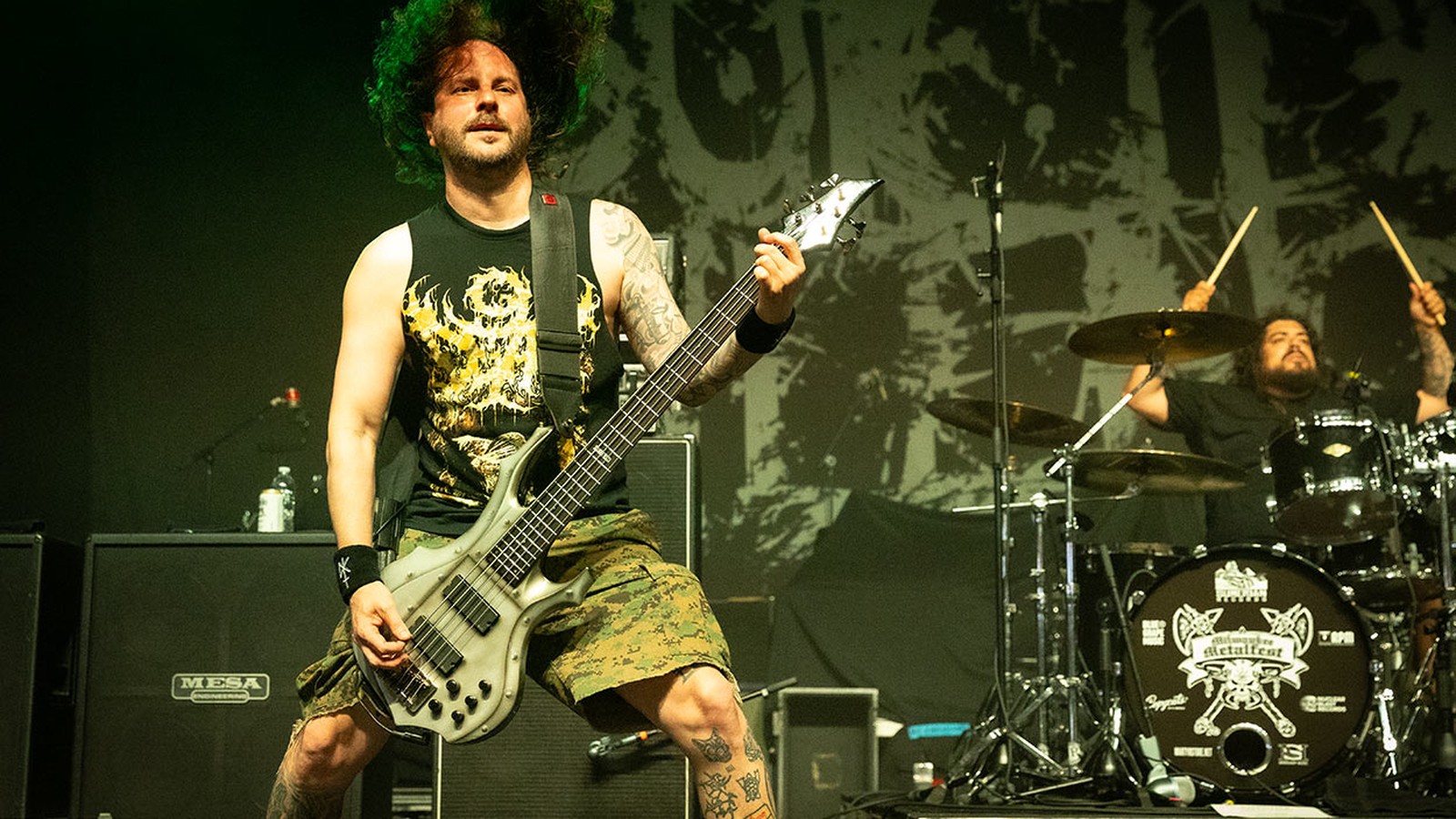
Drawn for a scene that found its first audience on MySpace, the site that went live in August 2003, and printed on black shirts stacked on folding tables in VFW halls, the veterans' clubs that rented their function rooms to all-ages shows, the deathcore logo did the one thing the extreme metal mark of the nineties had refused to do for a decade and a half, which was let a sixteen year old say the band's name out loud before the autoplay had finished loading the first song.
The Riverside quintet who flung their name across the front of the merch table in two lines of ink-cut capitals that still read as words was Suicide Silence, and the lettering was already on the sleeve of The Cleansing in 2007. Around them, a whole generation of bands sawed the roots off the letters, hacked the hairlines down to stubs and hung what survived on straight lines.
You could read it. In extreme metal, that was new.
The best of those marks hit the eye the way a two-by-four swung through the drywall of a rented practice room hits the wall behind it, splintered at both ends, ugly, and still unmistakably a plank, and they land on the shirt exactly where the breakdown lands on the floor: dead centre, all weight, no ornament anywhere a hand could reach.
What the deathcore logo inherited and threw away
The parents had spent years pulling the other way. Grown out of the Florida and New York scenes of the late eighties and pushed to its extreme by brutal bands such as Devourment and Disgorge, the death metal logo had turned into a test of membership by the mid nineties, a mass of strokes in which the name was present only for those who already knew it.
Black metal went further still. The reasons why black metal logos cannot be read belong to Norway and to the early nineties, to Christophe Szpajdel drawing the Emperor mark in 1992 and to a generation of symmetrical marks that only the faithful could parse, but the rule reached the American basement show as plain folk wisdom: the harder the band, the less of its name you got.
The other parent drew differently. Hardcore and metalcore bands of the late nineties mostly printed their names in blunt block capitals, often lifted straight from a typeface and run off a xerox for the flyer, because a band that sold its shirts by the box at the back of the room needed a name a stranger could ask for at the table.
Formed between 2002 and 2006 in Oakland, Montreal, Riverside, San Diego and Knoxville, the vanguard that first put deathcore lettering on a shirt split the difference with a precision nobody planned, keeping the spikes, the drips and the menace of the death metal mark while cutting its undergrowth back far enough that the word survived underneath, legible from six feet away and still nothing a parent would mistake for a church youth group.
Deathcore kept the threat and dumped the riddle.
A name built for the profile picture
MySpace changed the job. Every band got a page with a music player that started on its own, a picture slot at the top and a grid of friends rendered as tiny squares, and for several years that page was where a deathcore band was first seen by most of the people who would ever see it.
The picture slot was small. A logo that dissolved into grey fur at that size was a logo nobody clicked. The Glendale teenagers whose profile traffic exploded after the Doom EP of late 2005 were Job for a Cowboy, and the climb was steep enough that Metal Blade signed the band. In that economy a name a stranger had to type into a search box had better be one a stranger could read off somebody else's page.
Released by Century Media in September 2007, The Cleansing sent No Pity for a Coward out as an official video, and the band's mark is the clearest case of the MySpace style working at every size. Two stacked lines of black capitals sit across the top of the pale sleeve in a spray of flung ink, like a tin of black gloss kicked over across a loading dock, and the arrangement does on cotton what the music does in the room: the hard strokes carry the name the way the riff carries the song, and the spatter around them does the job of the pig squeal, noise thrown off the edge of something solid.
Reading a deathcore band logo across the merch table
Lay the shirts of the period out side by side and the conventions turn up fast. Names of two or more words often stack into two lines, so the mark stays close to square and fits a profile picture, a patch and a chest print without being redrawn. The strokes are sharp and scratched rather than grown, as if cut with a box knife. Horns and spines shoot outward from the left and right edges instead of crawling over the letters, which keeps the silhouette aggressive while the word in the middle stays clean. White on black is the usual shirt print, because it survives a one colour screen and a bad photocopy alike.
Whitechapel run their name along a single line of jagged capitals with long verticals stabbing below the baseline, and you can still read it from across a hall. All Shall Perish chose a dripping, broken blackletter, a nod to the death metal lineage with the letters left intact. Winds of Plague scratched theirs into thin, splintered strokes that a stranger reads at a glance.
The Montreal six who stack their name into heavy block letters with spines flaring sideways like the ribs of a wrecked umbrella are Despised Icon, and their 2007 album The Ills of Modern Man, the one that carried Furtive Monologue, did something more telling still: its front cover sets the band's name in one line of plain bold capitals, with none of the stacked, spined logo on it. A scene that could put a typeface on a record sleeve and lose nothing in menace had stopped needing the riddle.
A scene that could put a typeface on a record sleeve and lose nothing in menace had stopped needing the riddle.
Born in 1976 and the compiler of Logos From Hell, a 2008 compendium of heavy metal lettering, the illustrator whose work for Morbid Angel made his name in death metal, and who in 2016 worked on merchandise for Justin Bieber, is Mark Riddick. He is the nearest thing extreme lettering has to a bridge, a death metal draughtsman whose trade ran straight off the underground table and into the mall. The painters who made the sleeves are a separate cast, and deathcore album covers and the artists behind them have a different history, one of airbrush, digital collage and commissioned oils.
Symmetry comes back, and the letters stay put
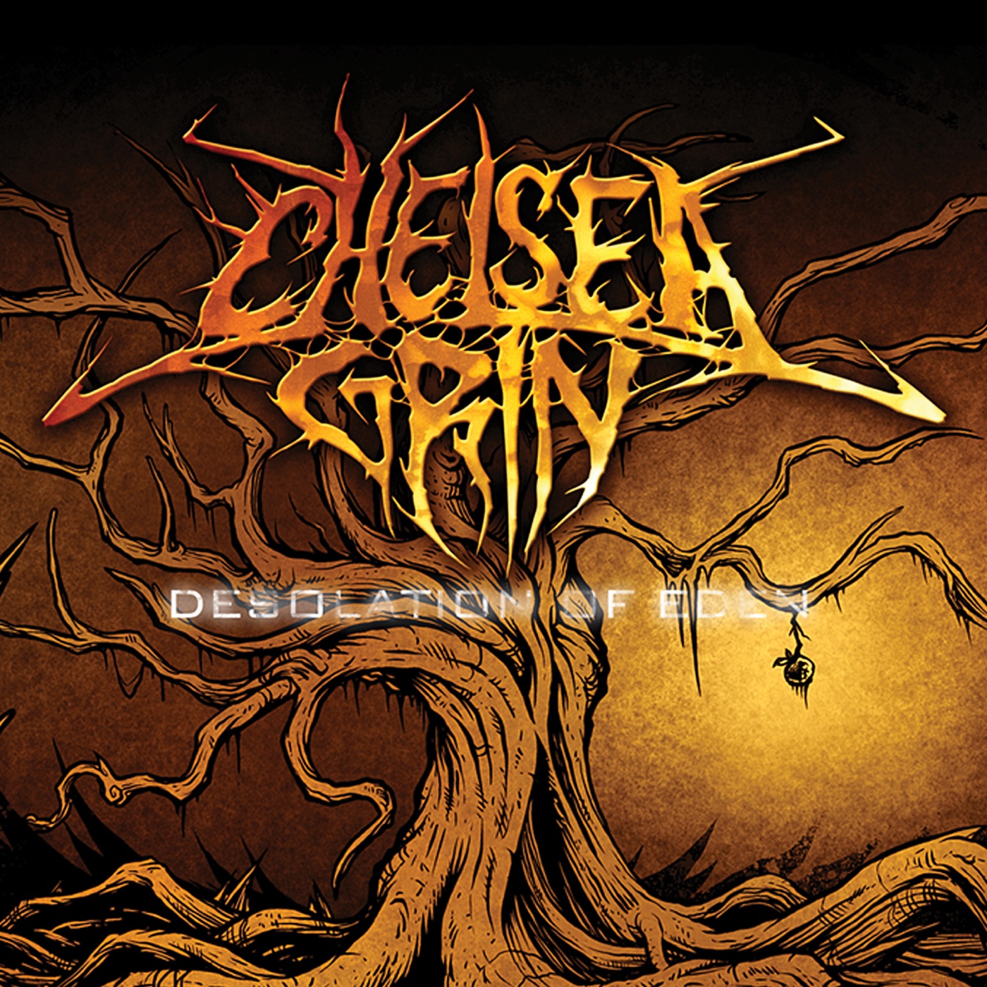
Recorded at Lambesis Studios in San Marcos, California, in August 2009 and released on Artery Recordings on 16 February 2010, Desolation of Eden put the logo of Chelsea Grin, a Salt Lake City band on its first album, across the top third of the sleeve, in two lines, with spines thrown out on both sides and a web strung between the letters, and it is the moment the deathcore mark began reaching back toward symmetry without surrendering a single letter.
Recreant is the song that came off that record with a video, a re-recording of a track from the band's 2008 EP, and its title makes the point about the mark by accident. Four syllables, an unusual word, and you can still read it on the shirt while the song plays.
The decade after that pulled the style sideways. The San Diego five now hanging their name inside a wide symmetrical arch strung with webs and drips are Carnifex, with a shape borrowed from black metal, on the sleeves of World War X and Necromanteum, where the older, slanted mark of Die Without Hope has gone. The Blacktown five who set a pentagram above a long symmetrical line of letters are Thy Art Is Murder, and every one of those letters is still a letter, on sleeves from Dear Desolation in 2017 onward.
The New Jersey band who carry the black metal silhouette furthest are Lorna Shore, whose mark carries a small sigil over its middle and curls a horn up from each end, spreading both arms across the shirt like the two stacks of a PA either side of the drum riser, the name pinned dead centre where the kick drum would be and every horn looking as if the low end had blown it outward. Look hard and it still spells the band.

Released by Unique Leader in October 2019, Vital Deprivation carries the mark of Signs of the Swarm, out of Pittsburgh, over a painted night scene, and the mark is an insect, wings spread, antennae curling up, the letters packed into its body so tightly that this is the exception, a modern deathcore logo where a first reading takes effort. Shadow of Intent went the opposite way, with two lines of horned, perfectly readable capitals that could sit on a festival banner or a phone screen with nothing lost.
The Connecticut band that tried the readable mark both ways is Emmure, formed in 2003 in New Fairfield. The band set its name in plain block capitals across the top of Speaker of the Dead in 2011, like a freight label stencilled on a road case, then swapped them for ornate blackletter on sleeves such as Hindsight. You can read either version from the back of the room.
The deathcore bands whose logo is worth a second look
Most of these marks are drawings rather than fonts, and each one argues something about the band behind it.
| Band | Formed | What the mark does |
|---|---|---|
| Suicide Silence | 2002, Riverside | Two stacked lines of hand-cut capitals in a spray of ink spatter |
| Despised Icon | 2002, Montreal | Heavy block letters in two lines, spines flaring sideways |
| Whitechapel | 2006, Knoxville | One line of scratched capitals, verticals stabbing below the baseline |
| All Shall Perish | 2002, Oakland | Broken blackletter with paint drips |
| Chelsea Grin | 2007, Salt Lake City | Two lines, spines on both sides, webbing between letters |
| Thy Art Is Murder | 2006, Sydney | Pentagram above a symmetrical line of readable letters |
| Lorna Shore | 2009, New Jersey | Symmetrical black metal mark, a horn curling up at each end, a sigil over the middle |
| Signs of the Swarm | 2014, Pittsburgh | An insect with the name packed into its body |
| Emmure | 2003, Connecticut | Plain block capitals on Speaker of the Dead, ornate blackletter on later sleeves |
Put those marks in date order and the arc is plain. The MySpace generation made the name legible because the name had to travel, through a profile page, a friend list and a stack of shirts held down with bungee cords in the back of a van. The bands that came after took the symmetry back from black metal as decoration, and kept the letters, because by then the readable deathcore logo was part of what the genre was.
A shirt gets judged by one test, whether a stranger can say the band's name from the far side of the room, and deathcore passes it more often than any extreme style before it. Of everything the scene off the record produced, the pits, the slang, the merch tables, the logo travelled furthest, onto mall racks, and the lettering trade around it ran wide enough that in 2016 a death metal illustrator was working on a pop star's merchandise.
The longer story, the road that took deathcore from MySpace to the arenas by way of the Montreal and Riverside bands and the revival, belongs to the genre's history. The logo changed less than the sound did. It started readable and, against the habits of every heavier style around it, it mostly stayed that way.
