
In 1998 the pumpkin stopped smiling.
Wedged into the band's name where the O should stand, on the sleeve of Better Than Raw, the friendly jack o'lantern of the earlier records was scooped out and recarved into a slant-eyed, sinister face, and the German quintet that had carried a lantern inside its own wordmark since the eighties was Helloween, which kept that meaner pumpkin, with small adjustments, on its studio albums up to the self-titled record of 2021.
Nobody ever had to squint to read it. That is the whole contract of power metal band logos, and it sets them against nearly everything the heavier underground was drawing in the same years. A death or black metal name of the early nineties looks like a page of orchestral score fed through a shredder and glued back together as a thorn hedge of ledger lines, legible only to the players who already know the part, and it was built that way on purpose, to bolt the door against the uninitiated.
The power metal wordmark was drawn for the opposite audience. It has to name the band to a stranger standing at the back of a festival field, over forty thousand heads and through a bank of stage smoke, in the time it takes that stranger to look up, and every decision inside it, from the weight of the strokes to the metal finish and the emblem tucked into a letter, answers to that single requirement.
The lettering is one strand of the look of the genre, beside the painted sleeves and the mascots, and it is the most practical strand of all, because a painting can be admired and a name has to be read.
What power metal band logos are built to do
Legibility at distance sounds like a modest ambition. It is the harshest brief in the trade, because a name that must hold together on a backdrop banner stretched behind a drum riser must also survive a one colour print on a black shirt, a thumbnail on a phone screen and a patch stitched onto a denim jacket, and it has to look expensive in every one of them.
The best of these marks behave like the maker's name inlaid in gold across the fallboard of a concert grand, cut deep into the lacquer so the last row of the gallery can read it while the lid shudders under a fortissimo and the hammers pound the strings a hand's width behind it: a signature of pedigree that no amount of noise from the instrument is allowed to blur.
The best of these marks behave like the maker's name inlaid in gold across the fallboard of a concert grand.
The letters stay still. The music around them runs at two hundred beats a minute, the sleeves change painter every few records, and the name on top is the one thing the listener is allowed to rely on.
| Band | Sleeve | Year | Lettering | Emblem or device |
|---|---|---|---|---|
| Blind Guardian | Tales from the Twilight World | 1990 | Gold swash script | None; the capitals carry it |
| Gamma Ray | Heading for Tomorrow | 1990 | Red outlined capitals | Translucent blue pyramid |
| Helloween | Better Than Raw | 1998 | Bevelled capitals | Sinister pumpkin as the O |
| DragonForce | Valley of the Damned | 2003 | Gold angular fantasy script | Dragon wings off the end letters |
| Sabaton | Attero Dominatus | 2006 | Chrome spiked blackletter | A giant capital S |
| Rhapsody of Fire | Triumph or Agony | 2006 | Chrome bevelled script | A point splitting OF FIRE |
| Powerwolf | Lupus Dei | 2007 | White weathered capitals | Red running through the letters |
| Stratovarius | Polaris | 2009 | Silver bevelled capitals | A star in place of the O |
Blackletter and fantasy script, kept readable
The script came down the family tree, since the heavy metal lettering of the seventies had already borrowed its gothic from the printers of the fifteenth century, and power metal kept the flavour of the heavy metal lettering while filing the thorns off, opening the counters, spacing the letters and letting each one stand on its own feet.
Painted in gold across the top of Tales from the Twilight World in 1990, above a torchlit dungeon crowded with hooded figures, the swash capitals of the four Germans with a Tolkien shelf behind them belong to Blind Guardian, and they read like the title page of an illuminated manuscript. The B and the G curl out into long hooked tails, the strokes thicken and thin as if a broad nib had drawn them, and yet every letter stays separate, upright and unmistakable at a glance.
The fantasy script travels well because it borrows authority from old books without borrowing their difficulty. It says legend. It never says riddle.
Spread across the top of Valley of the Damned, the debut released on Noise Records in 2003, a pair of dragon wings unfolds from the first and last letters of the DragonForce name, the gold script between them sharp and angular, so that the whole word takes flight as a single creature and the band's subject is announced before a note of its famously fast music has been heard.
Named for the plate armour that covers a knight's foot, Sabaton went further into the gothic, and on Attero Dominatus in 2006 its name arrives in a spiked, bevelled blackletter polished to chrome, led by a capital S curled like the brass tubing of a French horn crushed under a boot heel, a letter heavy enough to anchor the rest of the word when the banner snaps in the wind.
The German band that dresses its werewolves in cassocks, Powerwolf, took the plainest road of all. On the black sleeve of Lupus Dei in 2007 the name stands in white, blocky, angular capitals, scratched and weathered as if chiselled out of a church wall, with a trickle of red running down through the middle letters. It is the one mark in the table that could be read from the far side of a car park.
The emblem inside the word
Built into the letter rather than parked beside it, the pumpkin is the single most useful idea power metal lettering ever had. It works like a tuning peg hammered into the scroll of a cello: pull it out and the whole instrument goes slack. When the band brought its former singers back for a world tour and released Pumpkins United in 2017, the song title simply named the emblem, and the crowd needed no further explanation. On the I Want Out live release in 1989 the O became a globe instead, a rare holiday for the vegetable.
Set in red outlined capitals over a translucent blue pyramid on Heading for Tomorrow in 1990, the name of Gamma Ray swapped the medieval for the science fiction without giving up an ounce of legibility, and songs such as Space Eater, from that same debut, matched the sigil to the sound. The pyramid is less a heraldic charge than a beacon, a shape that reads as a symbol even from too far away to read the words.
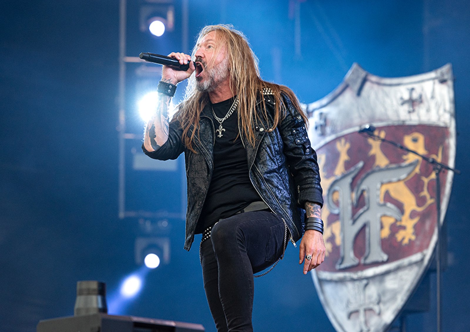
HammerFall carries its emblem beside the word rather than inside it, the knight and his hammer standing guard over the lettering from sleeve to sleeve, which is the heraldic solution: a shield bearer next to the name, doing the work a letter would otherwise have to do. The wordmark itself is plain bevelled capitals, no hammer cut into any letter, so the whole job of carrying the weapon falls to the knight standing beside it.
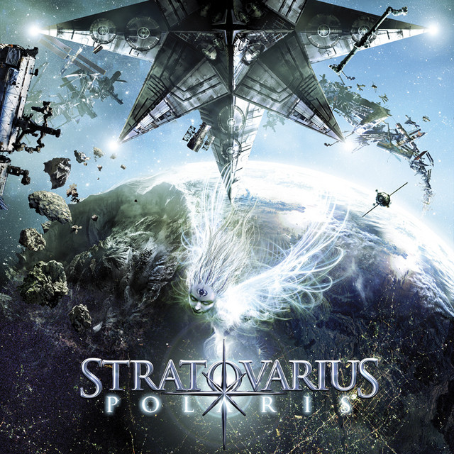
Named as a blend of Stradivarius and Stratocaster, the Finnish band Stratovarius redrew its logo on Polaris in 2009, and the new mark replaced the O with a four pointed star whose long lower ray drops straight through the subtitle, rammed down through the lettering like the soundpost a luthier drives up through the f-hole of a violin, a single spar the whole body of the word leans on. It replaced a Fleur-de-lis mark tied to founder Timo Tolkki, retired once he had left the band.
Chrome, gold and the festival banner
Metal finishes are not decoration here. A bevelled chrome or gold letter reads as three dimensional against a black shirt, it catches the lighting rig on a backdrop, and it speaks the genre's language of treasure, triumph and the gleaming armour of the cover paintings, which is why so few of the marks in the table are flat.
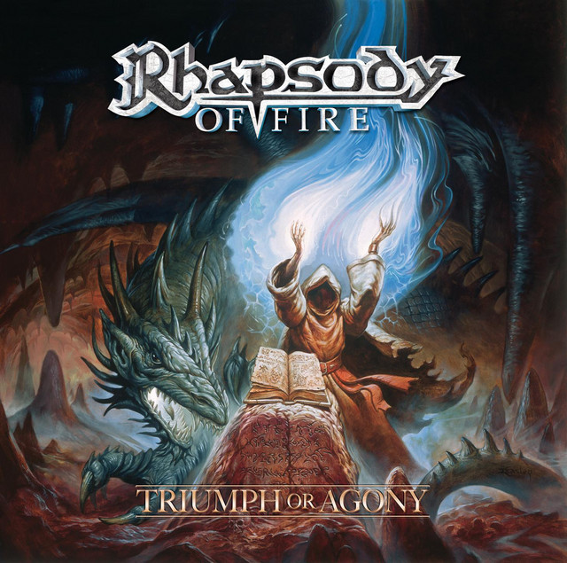
Forced by a trademark dispute to lengthen its name in 2006, the Italian orchestral outfit that had signed its first records simply as Rhapsody became Rhapsody of Fire, and Triumph or Agony shows how a good mark absorbs the blow. The ornate chrome script of the original survives intact, polished like the bell of a trombone aimed into the lighting truss, while OF FIRE sits beneath it in plain capitals, split by a single downward point.
The chrome throws light back at the far fence. The gothic confers age. The emblem supplies a picture for anyone too far away to read. Follow the genre from Keeper to the charts and the lettering keeps the same promise the choruses keep, that nobody in the field will be left out of the song for want of knowing its name.
That promise is the real difference from the unreadable marks of the extreme genres. A black metal logo consecrates a secret shared by the faithful; a power metal logo is a standard-bearer's flag, raised as high as it will go and meant for everybody, including the listener who has never heard the band.
The words inside the letters carry stories of their own, and how power metal bands got their names is the other half of the same design problem, since a name has to sound right before anyone can draw it. The logo only makes it visible. From the back of the field, visible is everything.
