
On 21 May 2009, nearly seven weeks before the record reached the shops, the cover of Ruination was unveiled: a horned figure with a goat skull for a face, sitting on a throne in a robe striped red and white, bombers crossing a ruined skyline on one side of him and fires burning on the other.
Credited with the art on that sleeve, on the front of Hell Chose Me for Carnifex and A New Era of Corruption for Whitechapel in 2010, and on Hate for Thy Art Is Murder and Demonocracy for Job for a Cowboy in 2012, the painter who spent four years hanging skull-faced priests, burning cities and horned kings across every shop rack that still stocked the genre was Brent Elliott White. One hand, five records, four bands. Deathcore album covers of that stretch had to do their work from across a shop or a screen, and his did, smashing through the shrink wrap and the bad light of the racks before anyone had pressed play.
A good sleeve in this music behaves like its own artwork blown up into a wrap down the side of the band's trailer, eight feet of painted skull sandblasted by a summer of interstate grit, gouged by the corner of a loading dock, its seams torn open by a tailgate swung too wide in a truck stop, and still readable to a kid in a car overtaking at seventy. The road beats the picture up. The picture has to survive the beating.
Most of them did.
The records under those pictures, from Montreal basements to arena floors, add up to two decades of deathcore, and in the MySpace years they were sold as a square of pixels on a profile page long before anyone held them as a square of cardboard. That fact shaped what got painted, and who got the job.
Who painted the deathcore album covers
The big death metal names came in for particular commissions. Pär Olofsson, Eliran Kantor and Dan Seagrave each painted for deathcore bands, and their sleeves are the ones collectors point at first. The bulk of the shelf, though, was drawn by a smaller bench of artists who worked again and again for the same core labels, Metal Blade, Victory and Century Media, and whose names sit in the small print rather than on the poster.
Credited with the album art and design of Oceano's Depths, released by Earache on 7 April 2009, with the artwork of Whitechapel's This Is Exile in July 2008, with both artwork and photography on Suicide Silence's No Time to Bleed in 2009 and with the layout of Ingested's debut that June, the designer whose name turns up across a long stretch of the MySpace-era shelf is Colin Marks. His Depths is a rock canyon with light falling down the middle of it, a few tentacles curling up from the bottom edge, and it carries the record's argument with hardly a monster in the frame: the band goes down, and you go with it.
Carnifex settled into a different habit. The San Diego band hired Menton J. Matthews III, who signs as Menton3, for Until I Feel Nothing on Victory in 2011, then handed Die Without Hope in 2014 to the artist who signs as Godmachine and kept him for the records after it. The Godmachine sleeve is a hooded skull with a red stone set in its forehead, framed in dense ornamental linework, every inch of the square filled. Black Tongue went to Ken Sarafin, who shares the art credit with guitarist Eddie Pickard, for The Unconquerable Dark in 2015, and the cover, a skeletal figure folded into a murky forest of moss-coloured drapery, takes a long look before it gives anything up.
| Year | Band | Record | Credited artist |
|---|---|---|---|
| 2007 | Job for a Cowboy | Genesis | Dennis Sibeijn |
| 2008 | Whitechapel | This Is Exile | Colin Marks |
| 2009 | Oceano | Depths | Colin Marks |
| 2009 | Suicide Silence | No Time to Bleed | Colin Marks |
| 2009 | Ingested | Surpassing the Boundaries of Human Suffering | Toshihiro Egawa |
| 2009 | Job for a Cowboy | Ruination | Brent Elliott White |
| 2010 | Carnifex | Hell Chose Me | Brent Elliott White |
| 2010 | Whitechapel | A New Era of Corruption | Brent Elliott White |
| 2011 | Suicide Silence | The Black Crown | K3n Adams |
| 2011 | Carnifex | Until I Feel Nothing | Menton3 |
| 2012 | Thy Art Is Murder | Hate | Brent Elliott White |
| 2012 | Job for a Cowboy | Demonocracy | Brent Elliott White |
| 2014 | Carnifex | Die Without Hope | Godmachine |
| 2015 | Black Tongue | The Unconquerable Dark | Ken Sarafin, Eddie Pickard |
| 2020 | Lorna Shore | Immortal | Caelan Stokkermans |
| 2021 | Whitechapel | Kin | Jillian Savage (cover painting) |
| 2022 | Lorna Shore | Pain Remains | Caelan Stokkermans |
| 2024 | Fit for an Autopsy | The Nothing That Is | Adam Burke |
The pantheon of this music's painters looks nothing like the one on the death metal shelf. A handful of names do most of the work in any given five years, the labels pass them from band to band, and when the decade turns the bench turns over almost completely.
The most shocking sleeves, and the one that was pulled
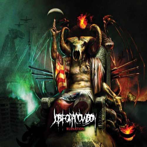
Recorded at AudioHammer in Sanford, Florida, with Jason Suecof producing, released on 7 July 2009 and sent out with a Metal Blade video for "Unfurling a Darkened Gospel", Ruination put the political record of the Glendale band under a political picture, and Jonny Davy described the songs as dealing with propaganda in the mainstream media and torture in American military tactics. The cover says all of that before the first blast beat. A goat skull sits where the head of state should be, the stripes hang off his shoulders like a captured flag, and the bombers scorch the horizon behind the throne. Nobody needed the lyric sheet.
Shock on a deathcore sleeve has mostly meant one of two things, the gore painting inherited from brutal death metal and the provocation aimed at church or state, and the genre has done both with full commitment. The gore end belongs to the slam side of the family. The Japanese illustrator who painted the front of Surpassing the Boundaries of Human Suffering, the Ingested debut released by Siege of Amida on 22 June 2009, was Toshihiro Egawa, and his picture is a field of red ground strewn with naked bodies, some of them hung on the thorns of a huge tentacled creature whose mouths fill the centre of the frame. It is meant to be hard to look at. It is.
Tony Koehl painted the cover of Perverse Recollections of a Necromangler, the 2007 album by Waking the Cadaver on Necroharmonic, a record whose title alone did most of the shocking, and seven years later the same hand painted Sun Eater for Job for a Cowboy. The religious provocation runs on a parallel track. Brent Elliott White's sleeve for Hell Chose Me puts a skull-faced priest in dark red robes in front of an eclipse, a cross hanging at his chest and a fire burning at his feet, and it reads as plainly as a slogan on a shirt.
The sleeve that went furthest never reached the racks in its first form. In 2015 the sleeve picked for Holy War by Thy Art Is Murder showed a child dressed as a suicide bomber, and the retail trade sent it back; the account of its two covers belongs with the look and the rituals. It is the mechanism in one case: a deathcore cover is built to provoke from a distance, and that time the distance included the buyers.
A deathcore cover is built to provoke from a distance.
Thumbnails and symmetry
The look of the genre came out of the size of the screen. A sleeve that would hang as a 300 pixel square on a profile page, beside a friends list and an autoplaying song, had to keep its shape when the detail was gone, so the artists drew big silhouettes, a central figure dead in the middle and a background that fell away into black or fire. Fine linework survived on the printed booklet. On the page it got crushed like a poster of the cover dropped at a winter load-in and trodden into the slush by thirty pairs of boots, every fine stroke ground into grey mush while the big black shapes held, and the covers that worked were the ones whose big black shapes still read as a skull.
Released by Century Media on 18 September 2007, Suicide Silence's debut The Cleansing wears a twisted figure whose head bursts into a crown of spikes, painted in browns and creams under the band's own lettering, and the illustration and design are credited to Dave McKean. It is closer to a gallery collage than to a death metal painting. The next record went to Colin Marks, and The Black Crown in 2011 went to K3n Adams, whose cover is a grey ornamental crown built around a ribcage and an eye in a triangle, perfectly symmetrical, the band's name in gold above it.
Symmetry did the heavy lifting from then on. A design that mirrors down the middle reads at any size, prints cleanly on a shirt back and holds up on a backdrop, and the decade after 2010 filled the shelf with it: altars, crowns, hooded skulls and sigils stacked dead centre, the eye pulled straight to the middle of the square the way the pit is pulled to the middle of the floor.
From paint to white space: the covers of the revival
The second wave changed the palette before it changed anything else. The scorched earth paintings of 2009 gave way to stranger, quieter pictures, and by the early 2020s some of the most talked about deathcore records of the decade arrived wearing covers that looked like they had been made for a different genre entirely.
Whitechapel's Kin is the first case. Two pale blue skulls face each other in profile, built out of thousands of dots on a black field, and the picture argues the record's subject, a narrator facing the darker double of himself, with no blood anywhere. Slaughter to Prevail gave Kostolom in 2021 to Daniel McBride. Fit for an Autopsy put a painting by Adam Burke on the front of The Nothing That Is, released by Nuclear Blast on 25 October 2024, an artist who had already painted the band's The Great Collapse in 2017.

Released by Century Media on 14 October 2022, produced by Josh Schroeder and carried into the German and Austrian top ten on the back of the revival, Pain Remains by Lorna Shore wears a black and white image of a hand gripping a knife against bare skin, the title in hollow capitals across it and white space above and below, and the artwork and layout are credited to Caelan Stokkermans, who had done the same job on Immortal in 2020. The cover strips the genre back like a green room wall scraped down to the cinder block with a putty knife, fifteen years of band stickers peeled off in long curls until only one dark shape is left on the bare surface. On a record of symphonic scale and a three-part closing title suite, the sleeve is the one place with nothing in it.
That is a small act of iconoclasm, and it worked. On any honest reading the white sleeve stands out on a festival merch wall full of skulls for exactly the reason the skulls once stood out on a wall of plain band photographs: it refuses what everything around it is doing.
Names were the other half of that first impression, painted or lettered right across the art, and the stories behind them, from film dialogue to game lore, are told in how deathcore bands got their names. The covers kept changing hands, from the core labels' house painters to gallery illustrators and back. The job stayed the same: hold the eye for one second, from across a room or a screen, and tell the buyer exactly how heavy the record is.
